
Martha Daniels
Martha Daniels: The Pleasures of Surface in Uncertain Times
Urban Mud
530 Santa Fe Drive, Denver, CO 80204
July 24-Sept. 26, 2020
Interview by Jillian Blackwell
This past week, I entered an art gallery for the first time in five months. I walked into Urban Mud to see Martha Daniels's solo show The Pleasures of Surface in Uncertain Times. The exhibition title was indicative of the experience—I found great pleasure in Daniels's surfaces, which were bright and colorful with great depth and emotional charge. The work in the show spans many years of her career and explores themes that she has been working with for some time.

An installation view of Martha Daniels’ solo exhibition The Pleasures of Surface in Uncertain Times at Urban Mud. Image by DARIA.
I had the opportunity to speak with Martha by phone to learn more about her process and her experience working in ceramics.
. . .
JB: Is there an idea that ties all the sculpture work in the exhibition together?
MD: That show is sort of like a retrospective. It’s selections from threads I’ve been working with since I moved to California, and I’ve lived in California for 10 years, although I still maintain ties to Colorado, where I lived for 40 years.

Martha Daniels, Material Matrix VI, 2020, hand-built Cone 04 fired, painted, and lacquered clay mounted in a painted and welded steel frame. Image by Jillian Blackwell.
There are underlying themes that you can’t see. All my work is cumulative, which means it’s made of pieces that are then assembled. If you look at anything in the show, there’s hardly anything that isn’t made that way. Even the things that are sort of like rocks or grapes are made of small pieces that are shaped and then stuck together, then smoothed over and then fired. The gold screen is made of assembled hand-built cubes. The big red figure is made from separate pieces that are sort of slab-like that I form and then let dry and then stick together with something like slip, and fire. Then obviously I can’t fit a figure that big in a kiln, so what I do is I fire parts of it and assemble it, and a lot of this assemblage is done with epoxy.
There’s one other underlying characteristic, which is it’s all about playing with structure.
I want to mention the third thing, which is part of the title, which is the surface. The ceramic surface has been very important to me for a very long time. I’ve never really taken a traditional approach, I’ve always taken an experimental approach. What can we put on it that still looks like it is ceramic? And I’m not alone in this approach. My work is sort of related to or influenced by Ron Nagle, and also the late Ken Price. I’m really crazy about both their work. And then Viola Frey, who did those monumental figures, her work kind of inspired me to do large figures.

Martha Daniels, Ribs and Guts, 2019, hand-built Cone 04 fired, glazed, painted, and lacquered clay. Image by Jillian Blackwell.
JB: Thinking about your title, the unsettled times, and your artist statement where you say you don’t speak specifically to things like that, but that there’s still a response—that emotional joy that can still be helpful in times like this. I was wondering if you could speak more about that?
MD: I’ve been doing this stuff for about 40 years and I can’t say that the COVID crisis has changed the way I work. It’s certainly made me think about a lot of things. One of my desires in my work was to aim for higher things—feelings, aesthetics, what unites us in humanity—and also give a sense of joy and beauty through the work. So, one would hope, looking at the work one gets a sense of uplift, and, in these times, maybe a little escape from everything around us. I don’t want to dwell on negativity, tragedy. I would prefer the sublime—whether I’ve achieved it or not (laugh).
JB: I would say when I walked in I definitely had that feeling of uplift. The color palette really brought that. Your colors are so bright.
MD: Thank you. Do you want me to talk about how I achieved those colors?
JB: Yes, I’d love to hear about that!
MD: As you noticed from the show, there are several different ways of using color. The large red figure has about thirty coats of a couple of different reds. Parts of that figure have a majolica-based glaze on it, but I decided that it wasn’t necessary. In order to get brilliant colors like that red you have to have a white or light-colored ground. I put many, many coats of white acrylic gesso on it, let that dry, and then started painting it with acrylics. I use Golden brand acrylics and also Charvin. When I’m done, I usually spray the painted piece with one of several things. The red figures are sprayed with Rustoleum clear, gloss, and semi-gloss sprays in various parts of the figure. So if you walk around the figure, you’ll see various parts are shinier than others.

Martha Daniels, Plant Form III, 2020, and Plant Form II, 2019, hand-built Cone 04 fired, glazed, painted, and lacquered clay. Image by DARIA.
The two plant pieces are painted with acrylics but in a very laborious manner. It takes me months to paint those pieces. There’s a lot of shading and repainting and sometimes a change of color. That’s an advantage of using acrylic paint for sculpture. With glazes, you can re-glaze things but there’s a limit—sooner or later they start to fall apart or turn black. With acrylics, you have a wide color range and I can keep repainting until I get something that I feel is appropriate to the forms and that finally looks like it’s finished. It has to go with the piece, it has to enhance the piece, and it has to add something extra to the piece while still feeling like ceramics.
The metallic colors and the interference colors—those come from autobody pigments that are used to spray cars. Some of the material comes from films and powders that are also used for nails, like if you want to get a manicure and you want unusual colors. I’m using those for sculpture. The fact that they change very slightly as you go around the piece adds a dimension and depth to it.
The other area of color I use is interference colors. Interference colors are called that because they interfere with the physics of light, so if you walk around the pieces, they change a little bit. And then the last thing is gold leaf, like on the small screen. I use traditional gold leaf techniques.

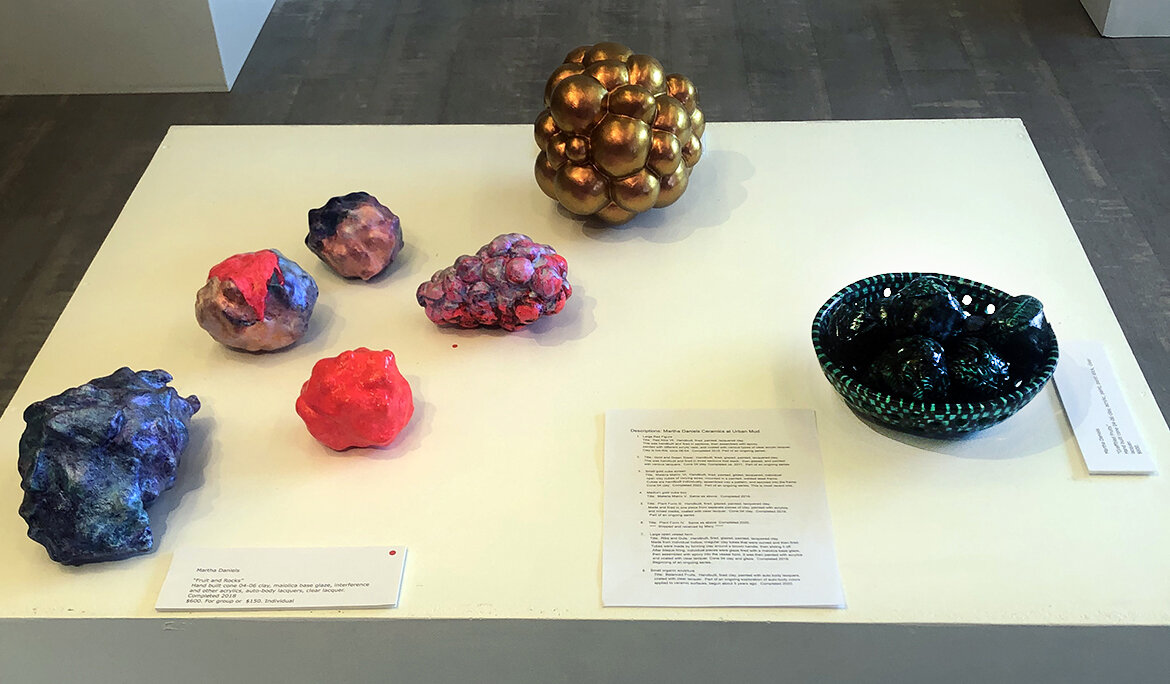
Martha Daniels, Kelp and Roe, 2020, hand-built Cone 04 fired clay, majolica base glaze, auto body lacquers, interference and other acrylics, interference films, and clear lacquer. Image by Jillian Blackwell.
JB: You said earlier that you’re interested in having surfaces that still speak to it being ceramic. You want to stay in the dialogue of ceramics, it sounds like. I’m curious to hear you speak to that.
MD: My idea of the ceramic surface is similar to Ken Price’s and Ron Nagle’s. There’s nothing traditional about it. But somehow, it still feels like it’s appropriate for clay. What ceramics is or what it can do is an area that’s being expanded all the time now.
JB: What do you think the future of ceramic sculpture is headed towards?
MD: You know, that’s a difficult question. I’ll just say what I observe right now. There seems to be a much more organic approach to ceramic sculpture. Maybe things that sort of look like masses of lava or a bunch of organic material kind of thrown together, and glazed with many different layers and colors. There still aren’t many people doing the surface treatments I’m doing, like what Ken Price did and what Ron Nagle is doing now. I think part of the reason for that is it’s exceedingly time-consuming, expensive, and it requires a lot of fussing (laughs). In some ways ceramics is a fussy medium. The question is where are we going to go beyond Ron Nagle and Ken Price? I don’t know (laughs), but I will keep exploring and if I come up with anything new I’m sure you’ll see it.
Various works in Martha Daniels’ solo exhibition The Pleasures of Surface in Uncertain Times at Urban Mud. Image by DARIA.
JB: You’ve had a long career in ceramics. How has the Denver and Colorado ceramics scene changed as you’ve been in it over the years?
MD: Well, you know I’m not there now, so I don’t know everything that’s going on. But early on, when I first came to Colorado about 1967 or so, there was a strong sense of connection with the craft. It was all craft-oriented. There were some really good annual shows and sales in Boulder. That was where I began to expand my interest in clay. Betty Woodman was there, and I got to know Betty and George, and became very friendly with Betty, and I always admired her work. Paul Soldner was in Boulder for a while, because his first degree was in Art Education from the University of Colorado. He became very friendly with Betty Woodman, and was already doing ceramics. He built Betty Woodman’s salt kiln. They used to fire this kiln together. Soldner created quite a bit of early work in Boulder.
The atmosphere in Boulder and later in Denver was complete support for clay, but you have to realize there were far fewer people working in clay then than there are now. In 1973 or so, I moved to Denver. About that time, Betty and George had moved most of their ceramic production to Italy. They were becoming internationally known artists. But I’m sorry to say, once you got past the craft level, there wasn’t really a market for serious ceramics. There used to be one gallery called Sun Sign that was run by a guy named Jerry Hodge. Jerry showed a lot of ceramics made by Colorado people.
I have to say Colorado somehow has historically been a place that has had interesting work in clay. It starts off with Van Briggle at the turn of the century and then continues right through. There’s just something in the atmosphere.
. . .
Daniels’s work echoes the styles of the ceramic titans she references—Ron Nagle, Ken Price, and Viola Frey. However, far from pale copies, her works carry a history of ceramics within them. Daniels’s particular voice is clear in the combination of elements—intense and unnatural colors with shiny and modeled finishes in playful dialogue with forms that recall organic structures. Her care for the process and her ability to work with the clay are apparent in her much-touched and well-worked surfaces. In these uncertain times, it is grounding to view objects that were created thoughtfully. This show provides an eddy of calm in a swiftly moving world.
Jillian Blackwell is a Denver-based artist and art educator. She holds a BA in Fine Arts with a Concentration in Ceramics from the University of Pennsylvania.


